Sunday 28 December 2014

Creature Designs


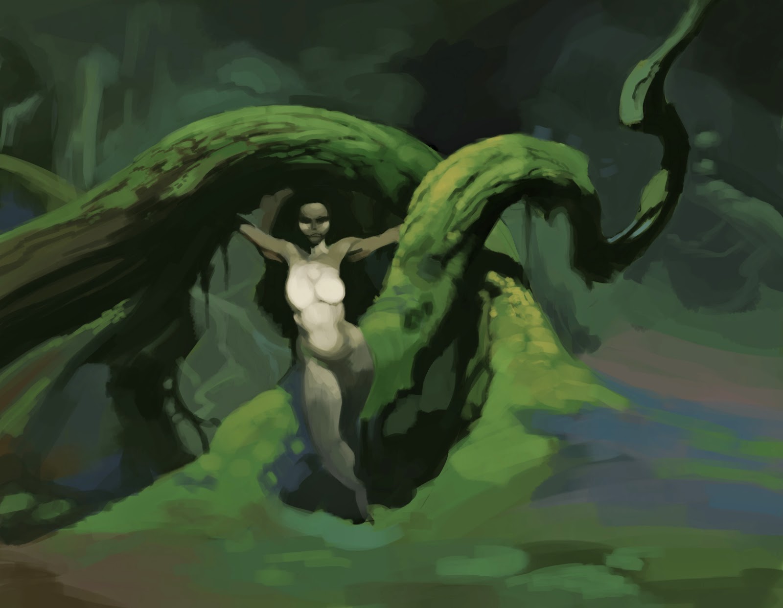
Been trying out some character design to see where my skills are at. They're very time consuming considering the form changes and colours, but I'm not being strict and trying to keep them quick, intuitive and fun. About 15 hours in total for both. Before I would do something for fun and just be deflated by what I think I should be learning. Now I'm just taking it easy and taking it back to the days of painting something for the fun of it
I copied the style and process of Mr Jack Art, an Australian artist who moved to the US to work with Blizzard - living the dream! A source of inspiration for myself.
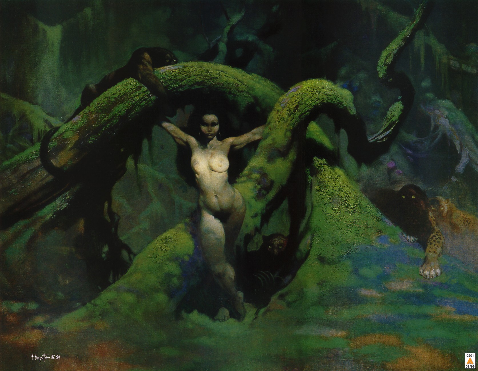
Here is his tutorial for the Hydra. There are many more tutorials on his DA account-
http://mr--jack.deviantart.com/art/Hydra-Progress-113069710
Creature ideas from Melvyn Yeo's DA account-
http://melvynyeo.deviantart.com/…/Fat-Katydid-Nymph-4106574…

Thursday 16 October 2014

Gouache and watercolour studies


I wanted to enrich the colours I used so the bug photo taken in UV was perfect to try that out and I think I was pretty successful.

Reference:
http://melvynyeo.deviantart.com/art/UV-Bird-Dung-Spider-Pasilobus-sp-387280513

Thursday 9 October 2014

Harvestman study

Getting into gear with painting more in gouache. Upon finishing it I've noticed I'm timid with colour and they start to become muddier as the painting progress. Gotta keep cleaner with my colour choice

Found a Deviantart account with awesome photographs of all sorts of critters from the undergrowth. They include detailed descriptions of the insects as well.

http://melvynyeo.deviantart.com/art/Harvestman-428907156

https://www.facebook.com/melvyn.yeo.9


Tuesday 7 October 2014

Alligator study

Digging deeper with this form and lighting/shadow business lately so I can be more fluent with my painting process. Some drawing exercises have helped a lot with the rough layout of the alligator as well.

Reference is of an American alligator.


Monday 29 September 2014

Kung Fu Panda studies


https://www.youtube.com/watch?v=ltbzLZHIK4I

The plan was to watch the whole scene and study stills throughout it, but every couple of seconds there was a good scene to study, So I think I only got 50 seconds into it.

Soon, I will be doing studies in gouache and this process was a way to get me more comfortable with it. They were done on one layer with very basic proportions first, wash layer primarily focusing on colours and light values. I should have worked on a white layer so I could preserve the light areas, but I suppose with gouache you can just paint over the top with white paint.

Sunday 28 September 2014

Not so sketchy morning sketch

What was supposed to take me one hour extended to three hours - whoops!

For the past year I've been looking at Mr Jack's work, an Australian living in the US working for Blizzard. His attention to forms is astounding, but now I'm understanding more and more what he's thinking about when he 'sculpts' his artworks.

I planned out the sketch a lot first, but slipped up a bit when it came to defining the shapes in 3D, but at least now I've narrowed down what I need to practise and HOW I think I need to practise it (an important part that I often neglect).


Monday 15 September 2014

Anatomy studies


Anatomy study from references i purchased from- PoseSpace.com

Saturday 6 September 2014

Playing with colour

Came up with a quick idea and played around with a colour scheme from the water scene from Ghost in the Shell.

Closer


Been staring at this mug for the last couple hours. Sculpting is truly an intimate form of art.

Friday 5 September 2014

Old piece


Old Gouache piece for a Graphics Design course completed in 2012.

Wednesday 3 September 2014

So close!!


Note to self-
Never ever use soft sculpy again! Even with the wire armature up inside his palm, his fingers were still sagging. So many times I had to rework squished areas. The little flaky bits were driving me insane as well. Though I don't know if that is just a sculpy thing in general. *sigh* I think I need another medium for this type of work.

Nearly there.

Saturday 23 August 2014

Coraline Colour studies


Studied the different lighting scenes of Coraline.

I noticed while painting that if you start with a shadow base layer you can build up to your lights and as you do you introduce chroma that is of the light source subtly.


Thursday 14 August 2014

Iguana study


This reference was great because you see 4 out of the 5 types of lights clearly throughout or form changes of the Iguana:
lots of strong highlights
blue half tones
the nice big core shadow of the neck sack
beautiful golden reflected light

Then there occlusion shadows around the cheek area.

Would be nice to render it further but I would have to get fiddly with scales. If I'm studying animals for design then that would be more appropriate such as the patterns on a Tigers face. This was a colour and light study. Definition will come later with another creative piece that I want to put more time into.

Even at the time of uploading this I can tell I need to punch in more chroma into the reflected light. Generally everywhere as well.

Reference

https://www.flickr.com/photos/tambako/14510940987

Sunday 10 August 2014

Beetle shell study


My current understanding of what 'looseness' means is that the painting has been made to look like its been rushed together, but you still identify each layer of value that represents the form and lay down the appropriate colour. The loose part comes in when you don't worry about refining your brush strokes or smudging.

This is from the point of trying to understand looseness by practise, not being told what it is.

Reference
https://www.flickr.com/photos/tambako/9341194504/in/photolist-fes4FE-861KNj-hznCFx-7GM1k-az79zZ-8xEM5o-qN3tc-6tWukt-8J4J4g-Bcqwq-ry6jQ-JAE3v-7GHzpq-5HHMSX-dnZQpa-8hN4Mn-25XQA-hz4WKn-dCPyAj-yvzHs-fj11Ya-83hSY8-5HFCfW-51pE5X-8KvvLR-nwm3mB-6o1LWn-bpwjee-3AvBtV-33Ec39-3MHdHM-ehdJjz-6ZWASV-d1pgYG-2vL6RQ-83yX1E-7QXX5S-gRYSBi-9gkKro-8u9TyN-fWPeMe-uJJki-wvJCR-4XHLPg-eg4GPE-82KvEm-f5fQE-DCkA3-7AyV4A-bFuGne

Tuesday 5 August 2014

Forms - Painting the good stuff

Painted some unintentionally phallic objects today, but oh well, It got done.

The robot was from another day. They're so awesome to paint. So many different planes.


Saturday 2 August 2014

Shell drawing

Lately, I've been drawing a lot with pen to work on my careful line placement. so I thought I would go back and do a pencil drawing. This time I tried to use smudging but it doesn't feel like it was necessary - just easier because you can smear your value everywhere.

Three hours
Pencil on 220gsm


Line Drawing


Blocking in shadows


Wednesday 28 May 2014

Turtle Study

Was late at night and wanted to do any animal without fur so I did a turtle. Lots of lovely textures and colours.

I was using the new layering process and it worked a charm, especially when blurring out the areas that weren't in focus.

2.5 Hours Photoshop CS5.5


Monday 26 May 2014

Arm Study

Made an attempt to draw the arm while pronated today and forgot what how the brachialis was to fit between the bicep and tricep. So this is a study to make up for that.


Monday 5 May 2014

Finally getting it!

Just realised tonight what drawing and painting have in common. With drawing you layer up your lights and then into your darks (on white paper). You have to build up your values with pencil so its like you have to envision what the end value will be. You then work to that point. If its too dark, then you rub out the led and work lighter.

With painting, you have to build up from a base layer and continue to build up. Painting a bright value over a dark area will cripple the illusion of an object shape if not placed properly. Even a value that is only half a step above your base value will change the form. Continuously building upon each subsequent layer is how painting relates to drawing. It is continuously building and mixing colour. Your lights and darks only come right at the end to top off the piece. The mid tone is so important. Though its more particular with this piece because of the particles in the water bringing the lights and darks to a middle tone.

It feels like I've always known this information for so long but its like I never appreciated building up values as much before until now. Painting this hippo was such a pleasure to do and everything felt so intuitive once things finally clicked.

I'll keep it as a loose study since its time for bed.

Could be a lot lighter though, but didn't want to apply layer effects since I don't want to patch up mistakes with photoshop shortcuts. At least not for now anyway ;)

2 hours - Photoshop CS5.5


http://i1.ytimg.com/vi/2_sbiyM7UIQ/maxresdefault.jpg

Sunday 4 May 2014

Recent quick painting and sketch


Recent works

The first is of a water dragong. I tried applying new found value skills to the painting but I lost patience with my painting technique and have gone back to practising layering. I think I should leave self expression for a while and grind a bit more on layering.

The second are of pen studies of faces. For one of my classes I have to draw purely in ink so that I learn to control my lines more. I think its working out pretty well. Though I find it hard to get a sense of planes if their faces aren't tilted up or down.

Anyway, good fun.

Saturday 29 March 2014

Frazetta study


Trying out a new layering process. First I establish the lights and darks and then I paint over them with the mid tone. Don't think its very efficient though but its cool to see it work out.

Maybe i need to do a quick value and colour plan and when it comes for the final work I can just lay out the mid tone, put in the line work and build towards and back with lights and darks.

The original is here:

http://frankfrazetta.org/viewimage.php?loc=frank_frazetta_catgirl.jpg
http://frankfrazetta.org/images/frank_frazetta_catgirl.jpg

Friday 21 February 2014

Newport cliff edge study

Was enjoying the one of the last days of summer at Newport beach with my girlfriend and decided to paint the same cliff edge I painted about one or two years ago.

I took a reference to show what I studied from. I removed people from the foreground as well.

Its unfortunate that neither my photo or watercolour study are true to what I was seeing and laying down, but this definitely felt like a step forward.

Was a wonderful day.


Wednesday 12 February 2014

Candles...

Candles, monitors and eye strain
Oh my ...

I can't say I'll be doing a candle study with only the monitor light on in any time soon. I must have aged my eyes by like 3 years.

Also the candles kept going out. Though I kinda liked the challenge. Maybe next time I'll do something outside during the day.

Would have like to do a bit more but the candle said no.


Thursday 6 February 2014

Marble Heads


One of those artworks where I didn't know where it was going but in it for the journey.

Inspired by Honore Daumiers works...sorta lol. I could feel that the quick exercises paid off. Doing some more will work the muscle memory nicely.

Also next time I'll try something a bit more than circles :>

Saturday 25 January 2014

Honore Daumier Studies

Recently I've been infatuated with Honore Daumier's work. He was a caricature artist from the 1800s.

His works have a strong interplay between lighting and gesture, which I would like to reflect in my work. So the best way to do that is to study them!

There is specifically one work that particularly struck me during my studies even though there are others I would like to go over.

I wanted to go for simplicity and look for the initial impact of the composition and values. This way I can create a strong visual impact in my own work.


The Print Collector 1857-63
Image from - http://www.artcyclopedia.com/artists/daumier_honore.html


The lighting on the floor (A) and the slanted canvases (B) combine to make a ramp that directs the eye. The prints of landscapes (I'm assuming) (D) create a rhythm that also points towards that help create a focal point. The repetition also helps to convey this - 9 landscapes and one portraiture drawing.
The placement of the table (C) juxtaposed with the table underneath the focal point creates a direction that is similar to the direction created by the landscape prints. I'm not quite sure what the purpose of it is other than that.
Finally, there is (F) - the direction of the collectors gaze and the direction of his chest. The gaze is directed at the drawing while the plain of the chest feels like it is pointing towards the drawing. There is a slight variation in value between the side of the head and the face to indicate reflected light bouncing off the drawing.

I love how the composition feels so purposeful. That directions of plains are slanted to interact with light to aid in direction of the viewers eye to the focal point. Then there are the subtleties of the landscapes prints. They're all simple, but still have enough detail to suggest that they are 'there', but in low contrast.