Sunday 15 December 2013

Coraline Studies - Inspiration For More Narrative In My Work


Lately I've noticed that my artworks lack narrative. I realised this after looking at Sergey Kolesov's work. His concepts feel like there is a story happening with people and things interacting in interesting compositions.

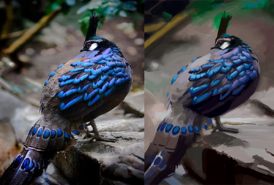
To work on this, I've been studying screen caps of Coraline where there are many elements making up a scene such as composition, lighting, gesture, interacting figures, textures - so many great things. Coraline used traditional methods to make the film so I feel like its a good idea to copy these instead of films using CGI. Firstly the models exist in reality and therefore obey the laws of physics in terms of lighting and form. CGI does damn well at replicating this but doesn't have to obey the laws, but is created to appear like it is. Sure Coraline would have used a lot of digital touch ups on colours and lighting but it still had to start in the physical world.

References -

http://disneyscreencaps.com/coraline-2009/1/#/

Sergey Kolesov

http://vimeo.com/channels/peleng
http://www.inprnt.com/search/?q=Sergey+Kolesov
http://pelengart.blogspot.com.au/

Tuesday 10 December 2013

Exposing my colour fraudulance

Way too much red and yellow. GAH!

This was painted with afternoon ambient light so I had to be quick. Was about 50 mins.

Monday 2 December 2013

Resident Evil Remake BKG


I found the backgrounds in this game very inspiring because of their sombre tone. Damn awesome game as well.

Gouache on 300gsm hot pressed paper.

Sunday 1 December 2013

Rody


Loved the atmospheric perspective dust in this one separating the Rody and the clown behind him. Such a great shot so I had to paint it as soon as I could.

Rosen


Lighting scheme was inspired by a scene out of Coraline.

Wednesday 23 October 2013

Not quite sure where this picture is originally from but I found a powerpoint of National Geographic photos called - Photo Mix 21

Took about 2hrs and 30mins. I wasn't focusing on correct proportions too much but I do feel I get tunnel vision and don't 'stand back' from the painting. I also changed it to CMYK halfway through the darn painting - whoops!


Monday 21 October 2013

Perdy berd


Life study from a Bird of Fashion slide show. Not quite sure what the primary source of it is but you can find the slide show in the link below. Lots of inspiring beautiful bird pictures.

2 hours

http://www.slideboom.com/presentations/631307/Birds%27-high-fashion-show

Sunday 6 October 2013

Boscimani

Needs more red and the forehead is too low though I still like how the colours and wrinkles turned out.

2 hour study


Picture from:

http://farm4.staticflickr.com/3479/3709823950_64d1ac27e0_o.jpg

Friday 4 October 2013

Shrimp Mantis study

Was watching a documentary on under later life and this guy really caught my eye.

So colourful and nimble. Can strike an enemy with blinding speed.

I made a point of being deliberate with my strokes in terms of direction, value and colour while keeping things loose. Additionally, I used 100% for the majority of the strokes so that I could enfore this. I've noticed that if you use opacity pressure then you can compromise the form of your subject so thats why I went with 100%.

Wasn't an aim to go for fine detail. Just form, value and colour I would prefer to do that if I'm copying this for reference for a personal piece.

I can already tell where I went too dark and too light. Especially with the eyes and legs.

3 hours approx


Reference from:

http://www.scimix.com/wp-content/uploads/2011/01/Mantis-Shrimp.jpg

Sunday 29 September 2013

Tortoise study

I loved the colours on the shell and texture of the skin so it seemed fitting to have a go.


I'll be posting the picture that I studied from to show my take on it. It will show my progress better than showing my study alone. However, life studies out of the computer will be a bit more difficult. Hoping to get a nice camera soon.

Reference:

http://www.cgtextures.com/texview.php?id=16932&PHPSESSID=0l7gt3cs44ijpbsemq944u9em2

Mystery of Colour layer in Photoshop - a CMYK and RGB comparison

Recently I've been applying the values of my painting and then laying down a colour layer on top. When I do this I work in CMYK and use the CMYK sliders. Feels like I'm taking more of a traditional to colour mixing. If you work in an RGB document then you wont have the issue I'm going to address. I prefer working in CMYK first so that I'm always working with the colours I'll be seeing on the print.

To the problem. It starts when working with the 'K' slider, which is basically black. However, this is where you can get mislead. You can have to different 'greys' that will look the same but their constituents are different and this is what can mess you up when you apply colour on your 'colour' layer.

Here we have two greys:


Here they are side by side:


There shouldn't be a problem when appyling your colour on your colour layer right? Well...there is and here is an example:


You can see the red is over both of the dark greys. Where did the red over the left square go? Why did it go? My only guess is that 'K' doesn't hold any properties that interact with the colour layer but why can't a colour layer interact with a grey? I don't know how to be less vague than that. Hopefully someone else can chime in. The C, M and Y colours do hold properties that interact with colour layer, hence why the red is showing up in the example. 

Use the gradation of grey to black swatches in your tools for Photoshop to avoid this problem. Don't move the K slider just by itself.

So...back to my Mantis Shrimp study that is riddled with this problem :<