Monday, 5 May 2014

Finally getting it!

Just realised tonight what drawing and painting have in common. With drawing you layer up your lights and then into your darks (on white paper). You have to build up your values with pencil so its like you have to envision what the end value will be. You then work to that point. If its too dark, then you rub out the led and work lighter.

With painting, you have to build up from a base layer and continue to build up. Painting a bright value over a dark area will cripple the illusion of an object shape if not placed properly. Even a value that is only half a step above your base value will change the form. Continuously building upon each subsequent layer is how painting relates to drawing. It is continuously building and mixing colour. Your lights and darks only come right at the end to top off the piece. The mid tone is so important. Though its more particular with this piece because of the particles in the water bringing the lights and darks to a middle tone.

It feels like I've always known this information for so long but its like I never appreciated building up values as much before until now. Painting this hippo was such a pleasure to do and everything felt so intuitive once things finally clicked.

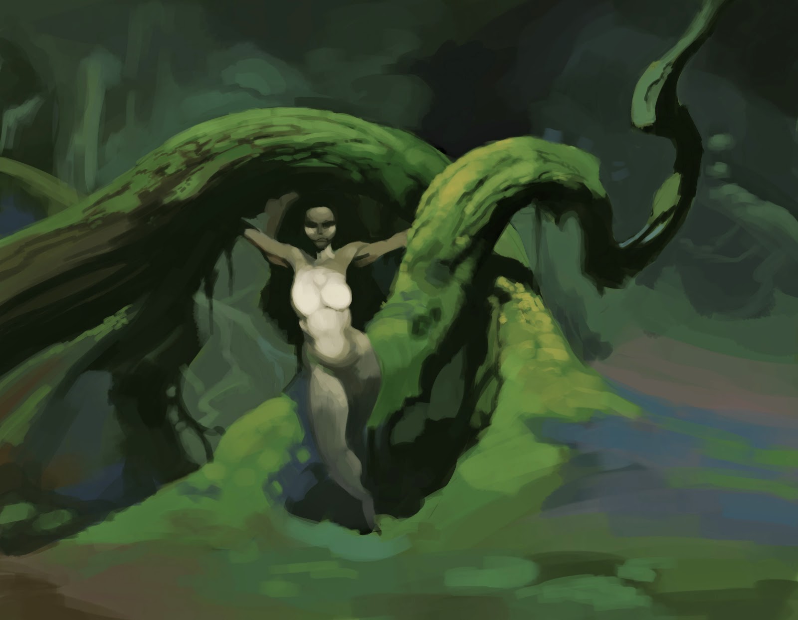
I'll keep it as a loose study since its time for bed.

Could be a lot lighter though, but didn't want to apply layer effects since I don't want to patch up mistakes with photoshop shortcuts. At least not for now anyway ;)

2 hours - Photoshop CS5.5


http://i1.ytimg.com/vi/2_sbiyM7UIQ/maxresdefault.jpg

Sunday, 4 May 2014

Recent quick painting and sketch


Recent works

The first is of a water dragong. I tried applying new found value skills to the painting but I lost patience with my painting technique and have gone back to practising layering. I think I should leave self expression for a while and grind a bit more on layering.

The second are of pen studies of faces. For one of my classes I have to draw purely in ink so that I learn to control my lines more. I think its working out pretty well. Though I find it hard to get a sense of planes if their faces aren't tilted up or down.

Anyway, good fun.

Saturday, 29 March 2014

Frazetta study


Trying out a new layering process. First I establish the lights and darks and then I paint over them with the mid tone. Don't think its very efficient though but its cool to see it work out.

Maybe i need to do a quick value and colour plan and when it comes for the final work I can just lay out the mid tone, put in the line work and build towards and back with lights and darks.

The original is here:

http://frankfrazetta.org/viewimage.php?loc=frank_frazetta_catgirl.jpg
http://frankfrazetta.org/images/frank_frazetta_catgirl.jpg

Friday, 21 February 2014

Newport cliff edge study

Was enjoying the one of the last days of summer at Newport beach with my girlfriend and decided to paint the same cliff edge I painted about one or two years ago.

I took a reference to show what I studied from. I removed people from the foreground as well.

Its unfortunate that neither my photo or watercolour study are true to what I was seeing and laying down, but this definitely felt like a step forward.

Was a wonderful day.


Wednesday, 12 February 2014

Candles...

Candles, monitors and eye strain
Oh my ...

I can't say I'll be doing a candle study with only the monitor light on in any time soon. I must have aged my eyes by like 3 years.

Also the candles kept going out. Though I kinda liked the challenge. Maybe next time I'll do something outside during the day.

Would have like to do a bit more but the candle said no.


Thursday, 6 February 2014

Marble Heads


One of those artworks where I didn't know where it was going but in it for the journey.

Inspired by Honore Daumiers works...sorta lol. I could feel that the quick exercises paid off. Doing some more will work the muscle memory nicely.

Also next time I'll try something a bit more than circles :>

Saturday, 25 January 2014

Honore Daumier Studies

Recently I've been infatuated with Honore Daumier's work. He was a caricature artist from the 1800s.

His works have a strong interplay between lighting and gesture, which I would like to reflect in my work. So the best way to do that is to study them!

There is specifically one work that particularly struck me during my studies even though there are others I would like to go over.

I wanted to go for simplicity and look for the initial impact of the composition and values. This way I can create a strong visual impact in my own work.


The Print Collector 1857-63
Image from - http://www.artcyclopedia.com/artists/daumier_honore.html


The lighting on the floor (A) and the slanted canvases (B) combine to make a ramp that directs the eye. The prints of landscapes (I'm assuming) (D) create a rhythm that also points towards that help create a focal point. The repetition also helps to convey this - 9 landscapes and one portraiture drawing.
The placement of the table (C) juxtaposed with the table underneath the focal point creates a direction that is similar to the direction created by the landscape prints. I'm not quite sure what the purpose of it is other than that.
Finally, there is (F) - the direction of the collectors gaze and the direction of his chest. The gaze is directed at the drawing while the plain of the chest feels like it is pointing towards the drawing. There is a slight variation in value between the side of the head and the face to indicate reflected light bouncing off the drawing.

I love how the composition feels so purposeful. That directions of plains are slanted to interact with light to aid in direction of the viewers eye to the focal point. Then there are the subtleties of the landscapes prints. They're all simple, but still have enough detail to suggest that they are 'there', but in low contrast.